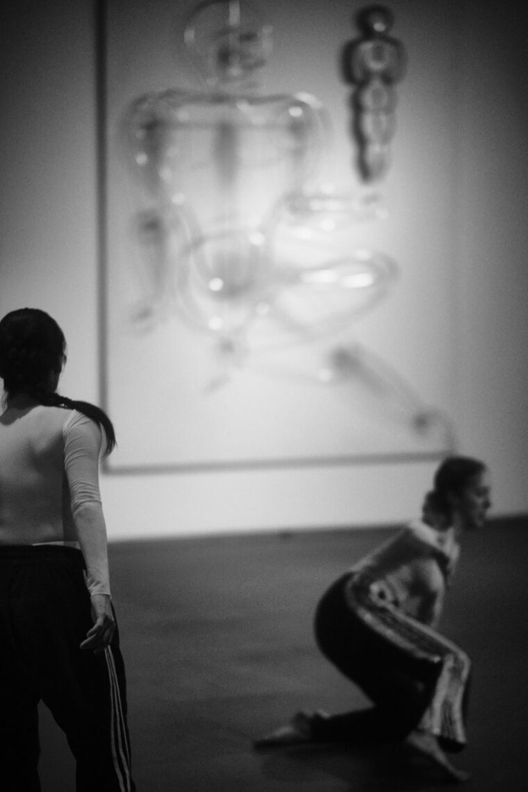
Action, Gesture, Paint
Women artists and abstraction worldwide 1940-70
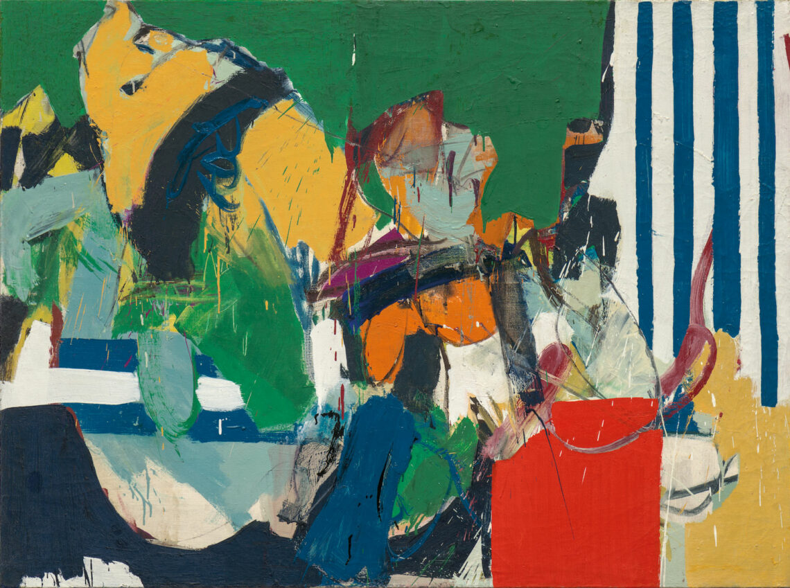
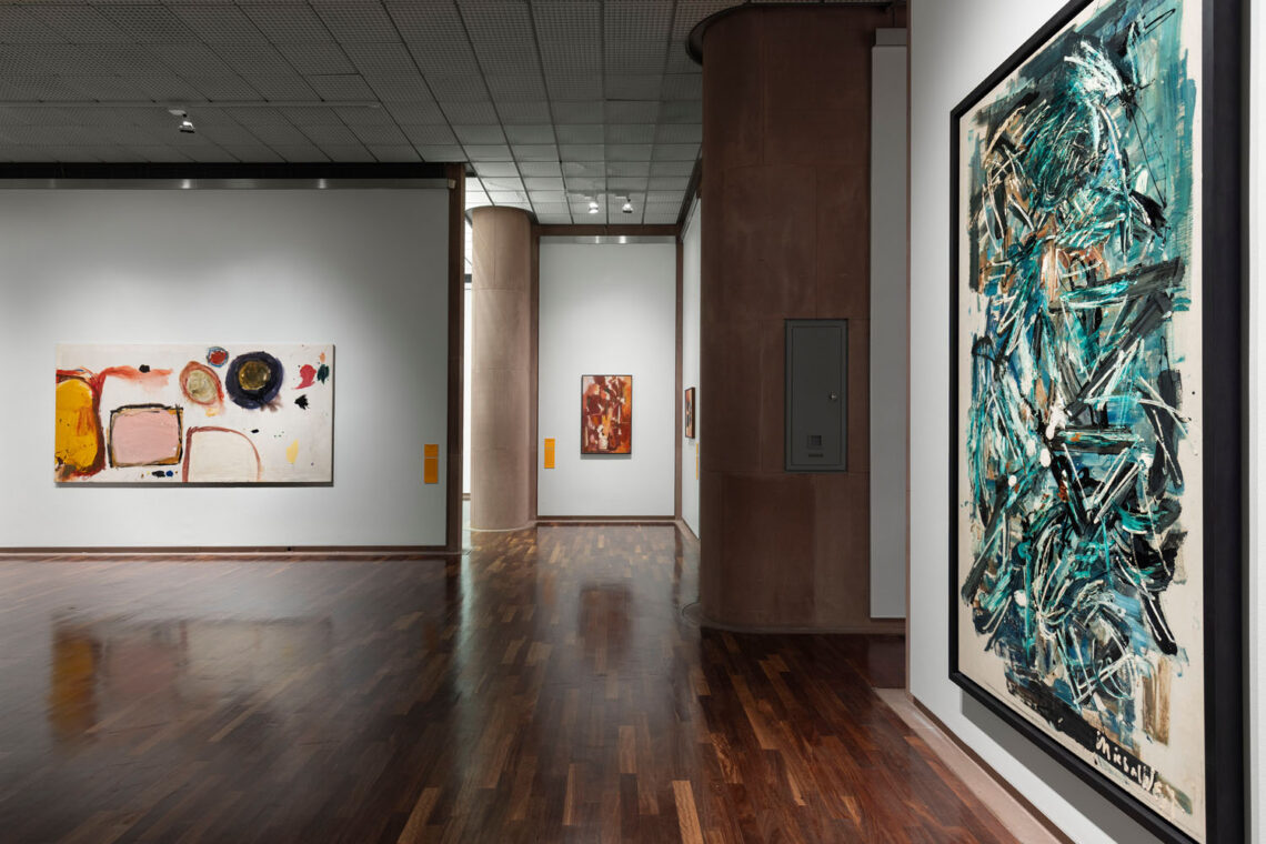
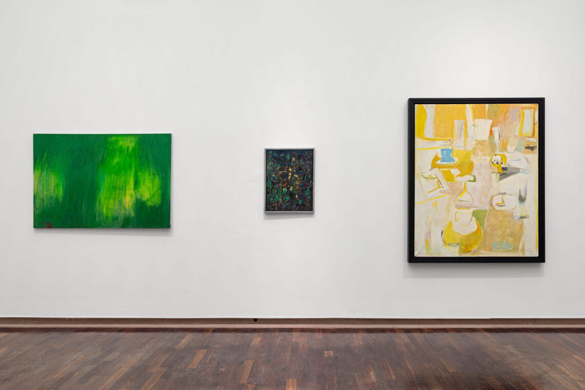
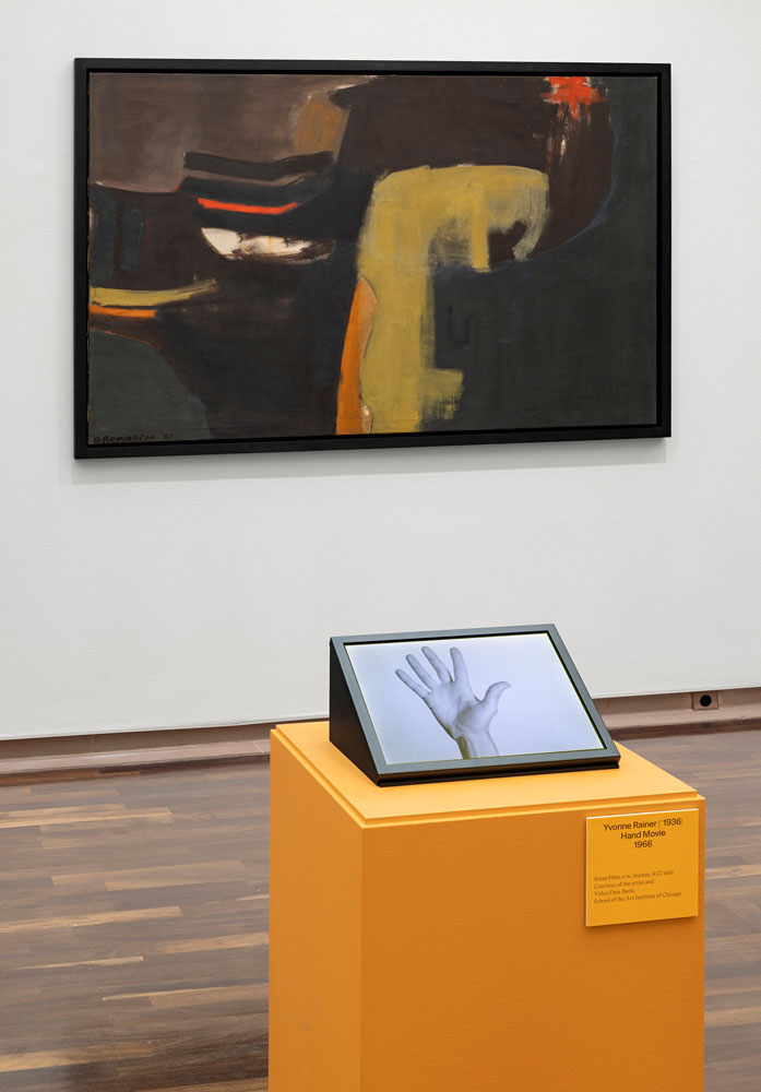
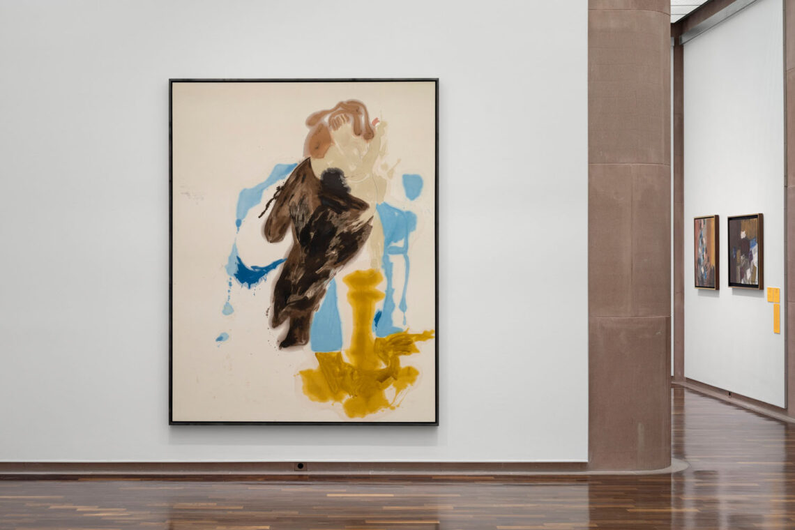
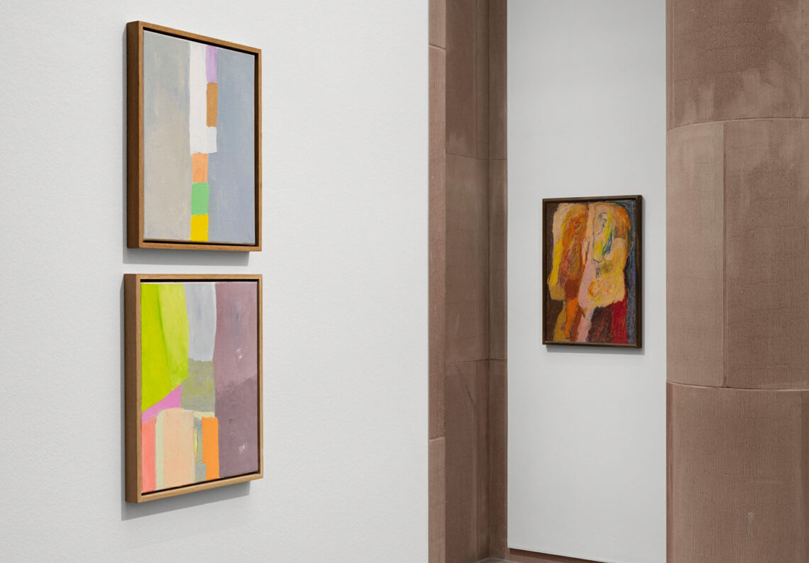
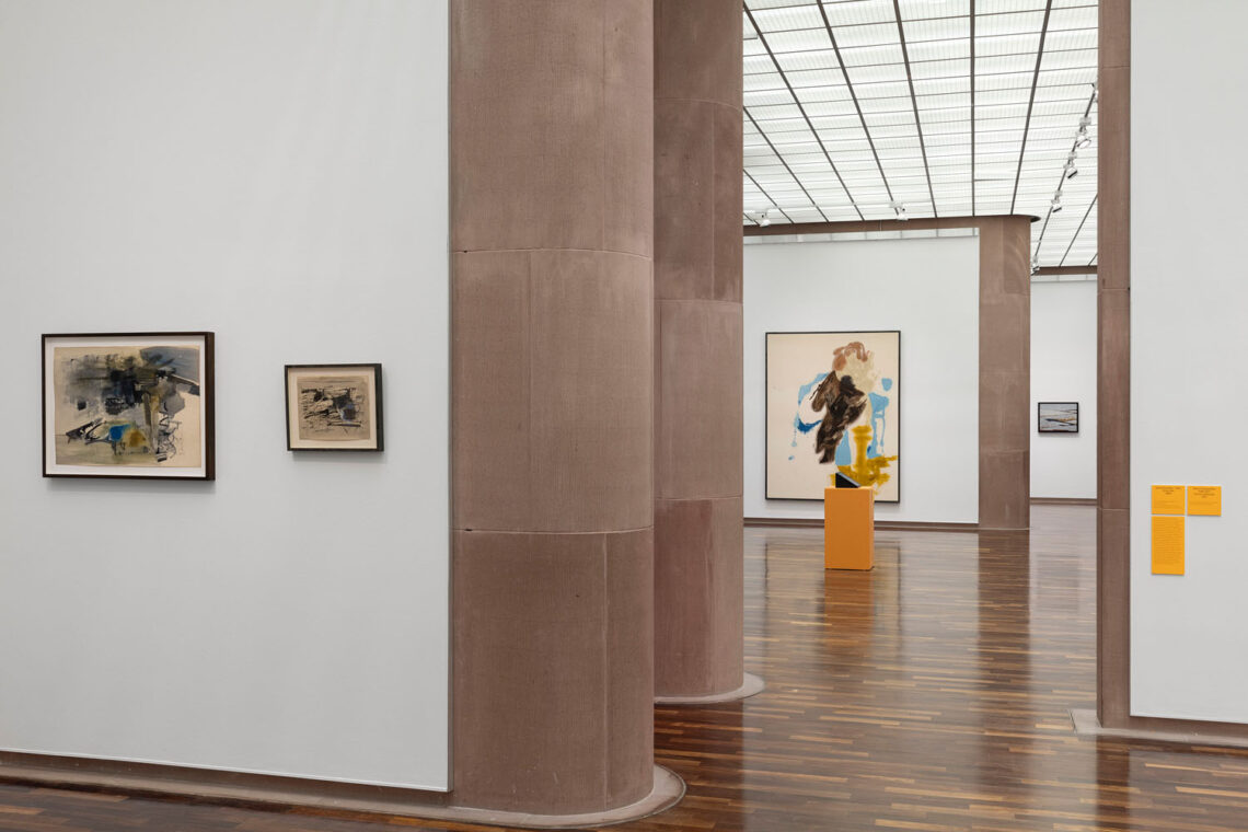
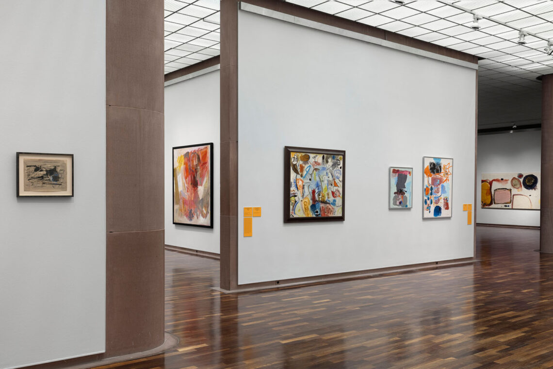
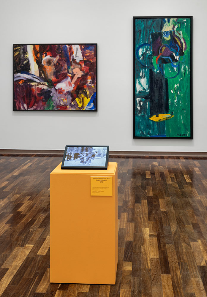
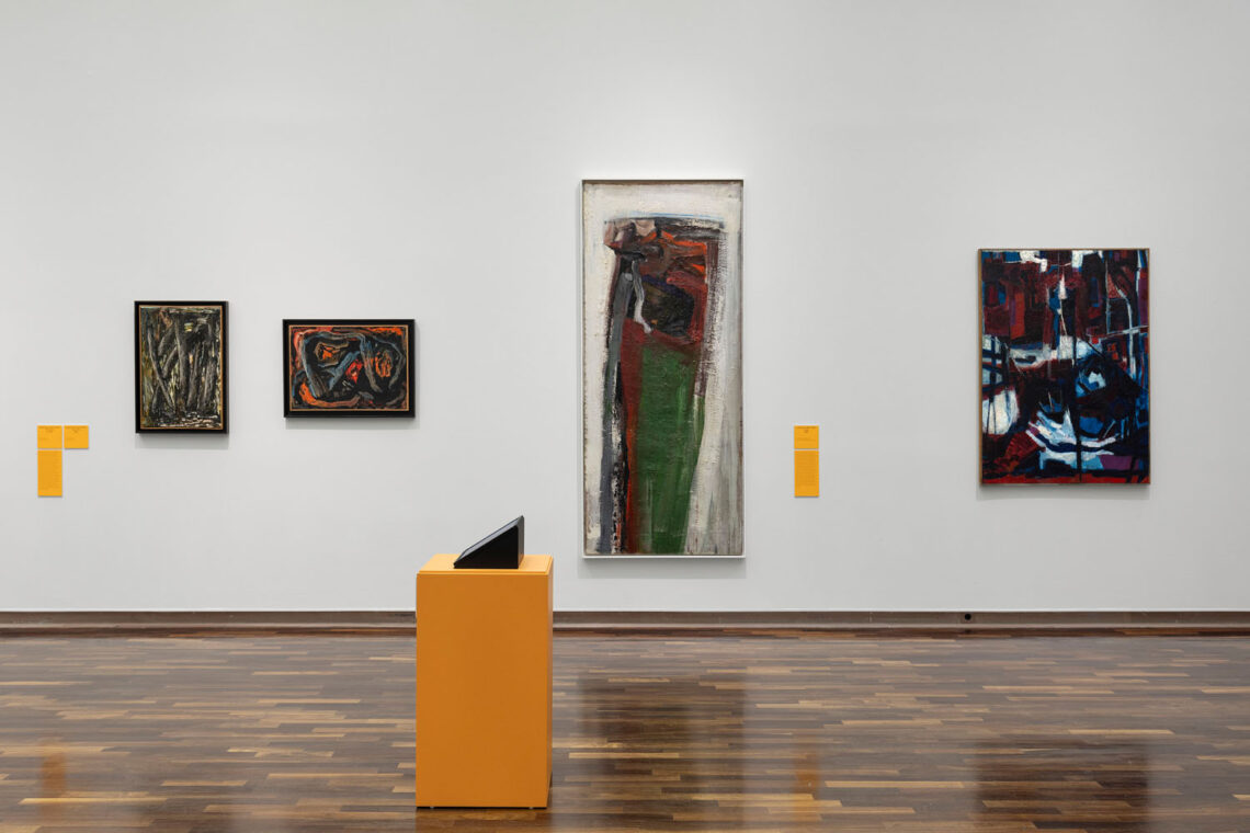
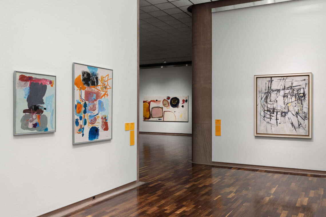
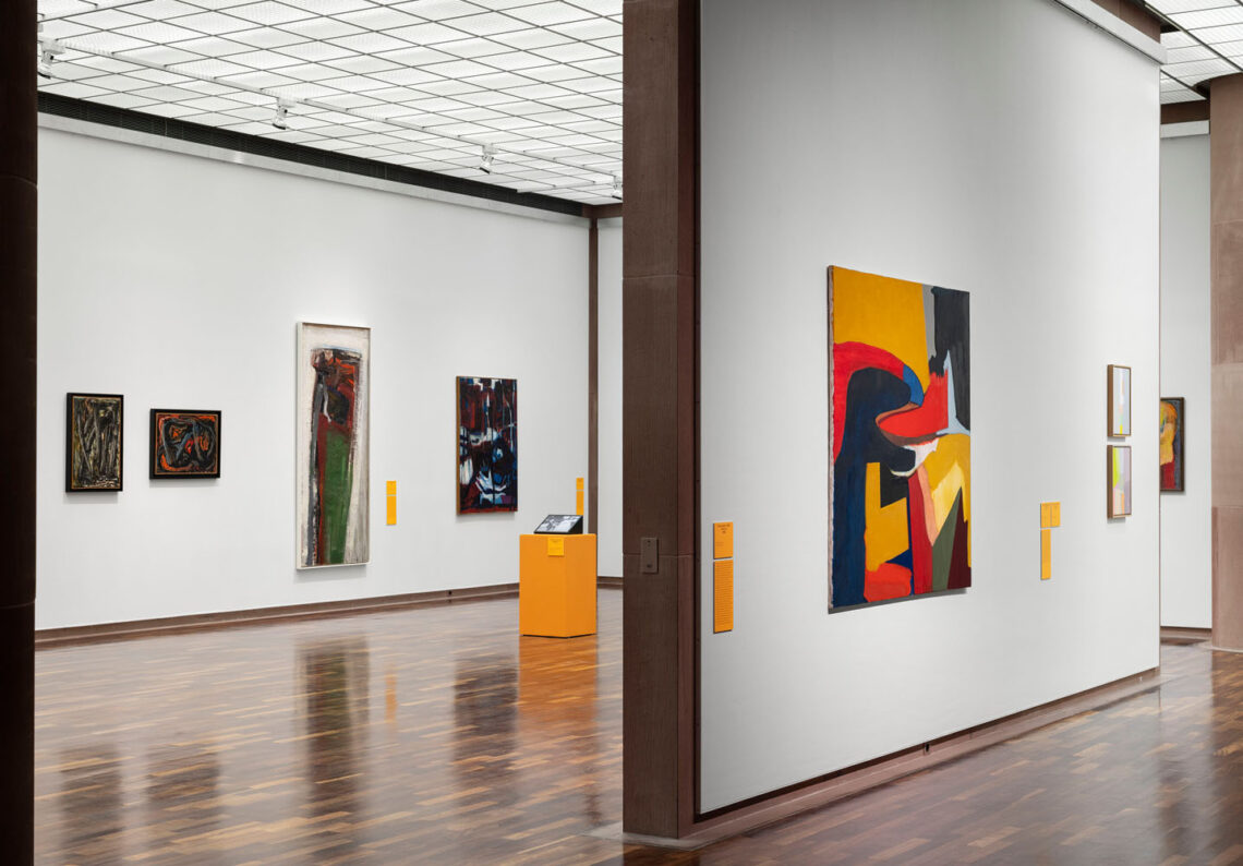
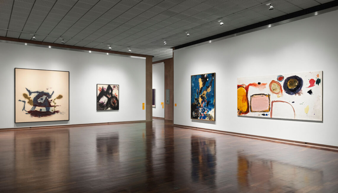
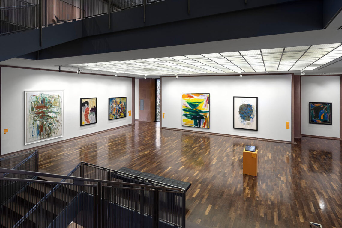
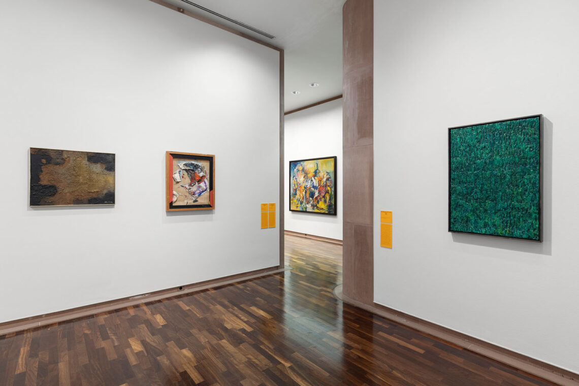
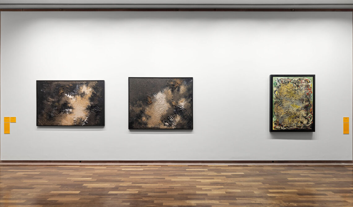
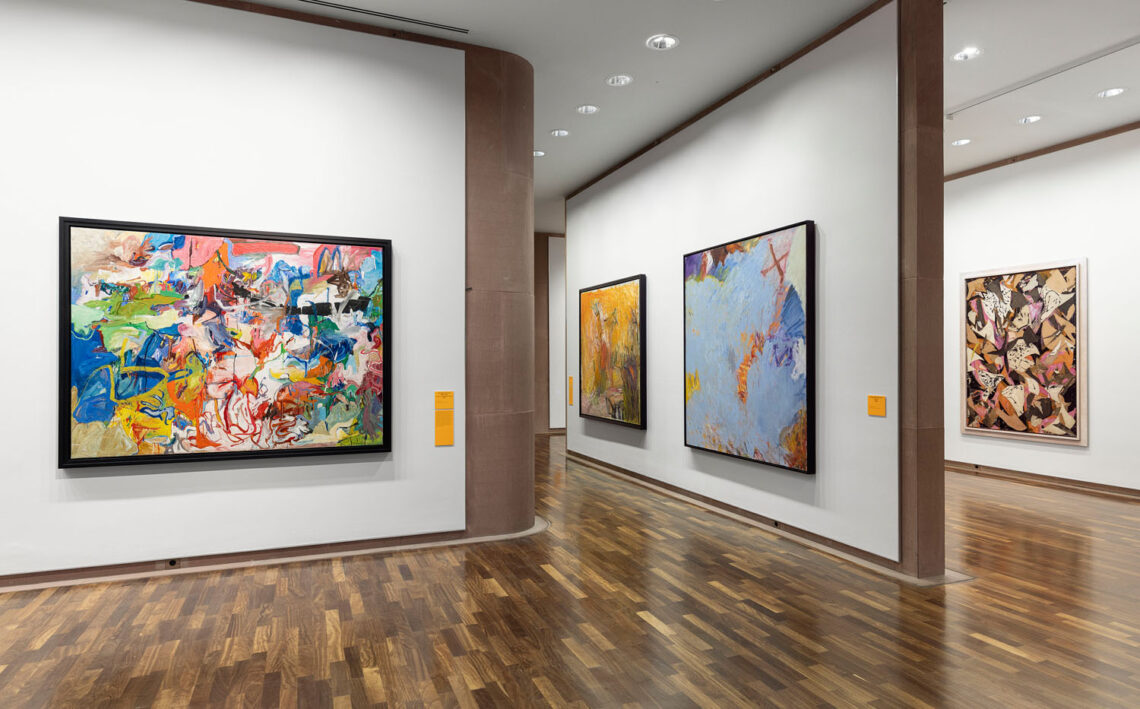
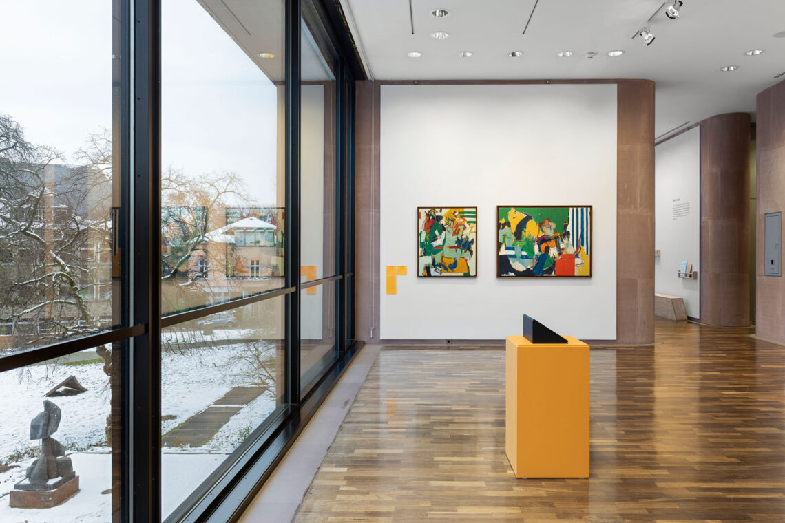
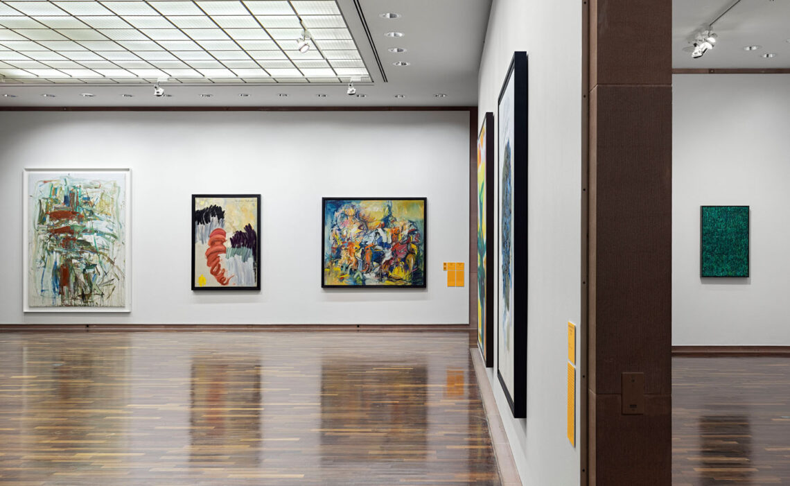
With an international exhibition cooperation, Kunsthalle Bielefeld presents an extensive global show that for the first time in Europe focuses on the work of female artists and their role in the development of abstraction after 1945. The movement we now describe as “Abstract Expressionism” officially began in the mid-20th century in the United States. But around the world, artists* explored parallel approaches to abstraction through materiality, expressivity, and gesture, from Informel to Arte Povera, from calligraphic abstraction and Gutai in East Asia to experimental, deeply political practices in Central and South America, North Africa, and the Middle East.
The exhibited artists did not work in a vacuum. The following graphic illustrates the worldwide networking of female artists with each other, with their male colleagues and with the international spread of abstraction. The map is an interactive representation of over 80 artists’ biographies from the exhibition catalog Action – gesture – color. Women artists and abstraction 1940-1970.
Following the avant-garde movements of Expressionism and Surrealism, these artists completely redefined creative practice as an immersive arena for action, process, and consciousness. Their paintings were not seen as images, but as events, and became catalysts for ideas in aesthetics, poetry, philosophy, and politics. Despite their essential role in the development of abstraction, the contribution of female artists in particular has been insufficiently appreciated by art history. In addition to works by well-known names such as Joan Mitchell, Helen Frankenthaler, and Lee Krasner, the exhibition also presents positions from the global South and East that have so far been less well-known in the West. The exhibition is produced in cooperation with the Whitechapel Gallery, London and the Fondation Vincent van Gogh Arles.

You can delve even deeper into the exhibition theme with our KB Journal articles below.
Articles on the topic: Artists’ groups
The artistic activity of many of the exhibited artists did not take place in a vacuum. On the contrary, they were often part of groups of artists of their time that are still well-known today – in the middle of the action and yet usually little noticed and too often overlooked in specialist circles to this day. The stations collected here tell some of these stories.

You are standing in front of the work “Untitled (Red Tree)” by the American artist Joan Mitchell from 1957. She is considered one of the leading painters of her generation. Like Perle Fine, Pat Passlof and Charlotte Park, Mitchell was one of the few female members of the New York “Artist’s Club” or “8th Street Club”.
Painters and sculptors who had their studios between 1st and 6th Avenues and between 8th and 12th Streets in New York in the late 1940s and early 1950s met here regularly. The club itself was located at 39 East 8th Street.
The members pursued the goal of promoting the visibility of art, especially abstract expressionist art. The club gave the New York art scene the vitality and international influence that Paris had long enjoyed.
In May 1951, the club organized a group exhibition in a condemned commercial building on 9th Street – the so-called “9th Street Art Exhibition”. Well-known participants included the expressionists Willem de Kooning, Jackson Pollock and Hans Hofmann.
Only 11 of the 72 exhibiting artists at the “9th Street Art Exhibition” were female. Another sign of how difficult it was for women to be recognized and valued as equal artists alongside their male colleagues. In addition, many of these female artists were married to successful male artists. Men’s careers often took precedence in everyday life at the time.
Joan Mitchell therefore liked to comment ironically on her works with “It’s not bad, is it, not bad for a woman?” –in German: “It’s not bad, isn’t it, not bad for a woman?”
Portrait via Wikimedia Commons, Unknown author, Joan Mitchell, marked as public domain, details on Wikimedia Commons.
Text: Charlotte-Sophie Laege
Audio by: Matthias Albrecht
Recording and editing in cooperation with the Making Media Space in the Digital Learning Lab at Bielefeld University.
The American painter Grace Hartigan, whose work “Cedar Bar (originally named ‘Aries’ in the Grace Hartigan Diaries)” you are currently standing in front of, came to New York in 1946 and joined a group of artists that later became known as the “New York School”. The loosely knit group of painters, composers and poets had settled in downtown Lower Manhattan in the 1940s and 1950s. The New York School had a significant influence on the art movement of Action Painting. Action Painting understands the act of painting as an event. Body, movement and gestures are elementary components of this type of painting, which often takes place on the floor rather than on a traditional easel. Broad brushstrokes, drips and splashes point to the physical actions of the artists. Can you find these elements in “Cedar Bar”?
Now let your gaze wander to the bottom right-hand corner of the picture. Grace Hartigan has clearly signed her picture here “Hartigan 51”. The number 51 stands for the year of origin, 1951. When looking at the other pictures, you may also have noticed that many of the artists have not signed their works with their full names. For example, other members of the New York School such as Elaine de Kooning, who signed her works with E.K. or E. de K., or Corinne West, who signed her works with her male pseudonym Michael West. Grace Hartigan also called herself George at times. An indication of how difficult it was for women in art to establish themselves and consolidate their place in the art world.
Text: Charlotte-Sophie Laege
Audio by: Charlotte-Sophie Laege
Recording and editing in cooperation with the Making Media Space in the Digital Learning Lab at Bielefeld University.
As early as the 17th century, a cultural change took place in Europe, in which France played a pioneering role alongside Italy. Important impulses for fashion and art came from Paris at this time, everything French was “en vogue”. This persisted into the 20th century. In France, and especially in the capital, there was a liberal atmosphere that attracted many artists from other countries – voluntarily or as refugees.
Venice-born artist Ida Barbarigo also came to Paris in 1952 and joined the “Nouvelle École de Paris”, a group of artists who lived and worked in Paris from the 1940s to the 1960s.
The first “École de Paris” – or “School of Paris” – had already formed before the First World War, whose most important representatives included Pablo Picasso and the Spanish painter Miró, and later Sonia and Robert Delaunay.
The members of the “Nouvelle École de Paris” – the “New School of Paris” or “Second School of Paris” – are mainly associated with so-called lyrical abstraction and Tachism. Tachism is derived from the French word “tache”, which in German means a “splash of color” or “spot of color”. Tachisme is characterized by spontaneous brushwork, drips and scribbled marks.
Ida Barbarigo’s works “Open Game” and “Promenade” reveal such elements of Tachism. In her works, the artist often uses rhythmic brushstrokes and sinuous forms, skillfully staged against light, airy backgrounds. Barbarigo often worked personal references into her works in order to, as she says, “unlearn” painting and come closer to her own meaning.
Text: Charlotte-Sophie Laege
Audio by: Charlotte-Sophie Laege
Recording and editing in cooperation with the Making Media Space in the Digital Learning Lab at Bielefeld University.
“It would be interesting if art scholars took into account the similarity of expression that artists in different countries find simply because they live in the same era.”
The quote by Peruvian artist Gloria Gómez-Sánchez calls for a broader view of all artists who worked with expressive abstraction between 1940 and 1970. And that’s what artists around the world did. Whether in North America with abstract expressionism or in informal art in the European post-war years.
Abstract artists often joined forces in networks or groups around the world and worked together – not only to save costs by sharing studios, but above all to be more visible.
The female artists in the groups also took part in the artistic discourse. Nevertheless, they often received less feedback than their male colleagues. Some of them were completely forgotten after their death.
If you would like to find out more about the diverse places of activity and connections of the artists in the exhibition “Action, Gesture Color”, please take a look at the network graphic at the top of this page.
Text: Charlotte-Sophie Laege
Audio by: Charlotte-Sophie Laege, Nadine Kleinken
Recording and editing in cooperation with the Making Media Space in the Digital Learning Lab at Bielefeld University.

The New York artist, sculptor and gallery owner Betty Parsons is regarded as the “mother of Abstract Expressionism”. She was known for her outstanding curatorial flair. After studying painting and sculpture in Paris from 1923 to 1933, Parsons opened a gallery in Midtown New York in 1946, where she exhibited the great artists of Abstract Expressionism – including Jackson Pollock, Mark Rothko and Hans Hofmann. The “Betty Parsons Gallery” gave the artists their first major exposure and became one of the most renowned art galleries in New York.
The gallery remained closed every summer so that Parsons could concentrate on her own artistic work. She once said: “When I’m not in the gallery, my own art takes care of my relaxation. That is my greatest joy.”
Parson’s works are characterized by abstracted organic forms floating on muted fields of colour. She often incorporated elements from nature. Don’t you agree that her work “Blue Fields” resembles a bird’s eye view of a landscape?
In addition to her male artist colleagues, Betty Parsons particularly promoted female abstract artists in New York and exhibited their works in the “Betty Parsons Gallery”. These include the artists Perle Fine, Judith Godwin, Lee Krasner, Ethel Schwabacher and Sonja Sekula. In later years, works by gay, lesbian and bisexual artists were also presented in her gallery. After Parson’s death in 1982, the gallery was closed.
Portrait via Wikimedia Commons, Lynn Gilbert, Betty Parsons ©Lynn Gilbert 1977, CC BY-SA 4.0
Text: Charlotte-Sophie Laege
Audio by: Charlotte-Sophie Laege, Nadine Kleinken
Recording and editing in cooperation with the Making Media Space in the Digital Learning Lab at Bielefeld University.
Contributions to individual works

Is that a landscape? Perhaps with a lake or a piece of bay?
Helen Frankenthaler painted this picture in 1974.
Actually, these are just colors applied to large areas.
But how is it that we could think it is a landscape?
Firstly, the extremely wide picture format – as we know it from the movies, perfect for depicting a landscape. On the other hand, it is conceivable that we once experienced these colors like this – or almost like this – in the interplay of light and color in nature. What’s more, Helen Frankenthaler has given her work the title “April Mood”.
Helen Frankenthaler once said about her art:
“My pictures are full of weather moods. Abstract weather moods, not nature per se. But a feeling. And the feeling of an order that we tend to associate with nature. Perhaps nature with its seasons. In any case, an ‘ordered nature’. And I think that art itself is an order out of chaos.”
Helen Frankenthaler has mastered the technique of using color in this way. Soak stain is the name given to this technique, which is also known in German as “Schüttbildmalerei”: thin paint is poured onto the raw canvas and then stains it very strongly because the paint can be absorbed well into the fabric. You will rediscover this technique in other works by Helen Frankenthaler in our exhibition and perhaps be able to understand it even better than here.
Portrait via Wikimedia Commons, Collection: Records of the White House Photo Office (George W. Bush Administration), 1/20/2001 – 1/20/2009,President George W. Bush and Mrs. Laura Bush with 2001 National Medal of Arts Recipient Helen Frankenthaler, marked as public domain, details on Wikimedia Commons
Text: Matthias Albrecht
Audio by: Charlotte-Sophie Laege, Nadine Kleinken
Recording and editing in cooperation with the Making Media Space in the Digital Learning Lab at Bielefeld University.
“And there appeared to them tongues as of fire, which were scattered abroad; and one settled on each of them. All of them were filled with the Holy Spirit and began to speak in foreign tongues as the Spirit gave them utterance.” Acts 2, 1-4
This quote from the biblical Acts of the Apostles describes the essence of the Christian festival of Pentecost. Pentecost is the English name for this festival.
Is there a tongue of fire in this painting? Buffie Johnson suggests this interpretation with the title of the picture.
The gesture with which the red structure was applied to the canvas signals strength. We associate the color red with fire. But also with femininity. With fertility. With the power to create life.
“I always had an altarpiece of the goddess in mind,” the artist herself once said about her painting. Feminine energy and vitality were her themes.
So this “Pentecost” may almost be an invitation to women. Becoming aware of your own strength. In the social environment of the 1950s and also in the neighborhood of the male artists of Abstract Expressionism, whom Buffie Johnson attested a “subtle misogyny”, this was a step towards feminism, which Buffie Johnson advocated from the 1960s onwards.
Text: Matthias Albrecht
Audio by: Matthias Albrecht, Nadine Kleinken
Recording and editing in cooperation with the Making Media Space in the Digital Learning Lab at Bielefeld University.
“In the 1950s, the canvas was a stage, painting was a gestural movement, if not speed, a substitute for the physical act of dancing.” (Miriam Schapiro)
This is also the case here. “Idyll 2” from 1956 appears like a dance of colors. Against a background of translucent yellows and blues, an animated hustle and bustle of different colors unfolds. Miriam Schapiro painted with a brush that applied the oil paint diluted with turpentine to the canvas in a way that was characteristic of this artist at the time: “Painting thinly and smudging” is how the artist herself describes her working method.
What is an idyll? It is actually the depiction of a landscape in which people live in a simple way. Happy and effortless, of course! For many visual artists and poets in the 19th century, during the Romantic period, this was the idea of the ideal life. It may be that Miriam Schapiro is referring to this. Perhaps Alfred Tennyson’s series of poems “Royal Idylls”, which tells the legend of King Arthur in a very unique way.
But maybe it’s not so much about that. It is more about painting what is idyllic for Miriam Schapiro. The state in which she paints. The speed. The clash of contrasts. The mixing of color tones. The dance.
Text: Matthias Albrecht
Audio by: Matthias Albrecht, Nadine Kleinken
Recording and editing in cooperation with the Making Media Space in the Digital Learning Lab at Bielefeld University.

“For me, a painting is first and foremost a verb, not a noun, it is above all an event and only secondarily a picture. […] I want gestures – every kind of gesture, all kinds of gestures – gentle or brutal, joyful or tragic, the gesture of space – rising, sinking, flowing, swirling: the gesture of light flowing or splashing through the paint.” says Elaine de Kooning herself about her work.
“Painting” is the English word for “painting”, but also for the activity of painting. That’s why she says: It’s a verb.
How do you feel about the painterly gesture in this picture? Elaine de Kooning has turned the green into a veritable phenomenon with a lot of verve and a broad brush. The light background with a few ochre, yellow and red to violet tones enhances the effect. This makes it clear who the “main actor” is here: it’s all about strength.
Elaine de Kooning saw herself as an artist on a par with the famous names of Abstract Expressionism. She wrote articles about this first major and globally successful American art movement. Before that, the major impulses in art had come from Europe. But why were women artists so much less recognized than men? Why was Abstract Expressionism portrayed as a “man’s thing”, especially by the male artists themselves?
Grace Hartigan, whose works you can also see in our exhibition, said: “Oh, these poor guys didn’t know what a male artist was, there was no ‘image’ for an American artist…, art was something you did if you were a sissy. So their only role model, the poor creatures, was the West, cowboys and laborers. So they all wore dungarees and tried to look very masculine and not look sensitive and effeminate. …these men had the shakiest identity of masculinity you’d ever seen.” Source
Portrait via Wikimedia Commons, Rochester Institute of Technology, Elaine de Kooning, RIT NandE 1974 Dec16 Complete, marked as public domain, details on Wikimedia Commons
Text: Matthias Albrecht
Audio by: Charlotte-Sophie Laege, Matthias Albrecht
Recording and editing in cooperation with the Making Media Space in the Digital Learning Lab at Bielefeld University.

Lee Krasner, whose real name was Lena Krassner, was born in New York in 1908 as the child of Ukrainian-Jewish immigrants. She decided early on to become an artist and studied at the Women’s Art School of Cooper Union from 1926, then at the National Academy of Arts. Later, Hans Hofmann, one of the most influential art teachers of the 20th century, became her mentor.
Krasner met the abstract artist Jackson Pollock in 1942. In 1945, Krasner and Pollock moved into a dilapidated house in the community of Springs on Long Island after their wedding. The Pollock Krasner House and Studio is now a museum and is a National Historic Landmark in the USA.
Lee Krasner’s life with Pollock was characterized by Pollock’s alcoholism, depression and infidelity. Nevertheless, Krasner was totally committed to her husband’s work and career, became his manager and secretary – and even scraped the paint off her own paintings after financial bottlenecks in order to create more painting surfaces for Pollock. She only achieved her worldwide breakthrough after Pollock’s accidental death in 1956.
Krasner’s first solo exhibition took place in 1955 at the “Betty Parsons Gallery”. After that, she gained ever greater recognition as an artist and remained artistically active into old age.
Lee Krasner’s life’s work comprises over 600 paintings, mosaics and collages. Her works were influenced by artists such as Picasso and Matisse, and later also by her late husband.
Portrait via Wikimedia Commons, Gotfryd, Bernard, photographer, Lee Krasner, artist, marked as public domain, details on Wikimedia Commons
Text: Charlotte-Sophie Laege
Audio by: Charlotte-Sophie Laege
Recording and editing in cooperation with the Making Media Space in the Digital Learning Lab at Bielefeld University.
“For me, art – the color in art – is a wonderful licentiousness… I don’t see why you shouldn’t indulge yourself, make yourself happy. To have fun. To delight in beauty. I want an art that intoxicates me in a grandiose way. I like that idea.”
Gillian Ayres loves color. In the quote, she emphasizes the uplifting effects she experiences through color. She explored ways of dealing with color that had not been common before. The creation of her works is all about speed. The paint was poured directly from the can or sprayed from the tube. She combined different techniques and integrated objects such as color locks into her pictures. Her later works, including “Break-off”, show cast or painted circles and geometric forms that extend beyond the edge of the picture, creating a deliberate imbalance. So the work seems to tilt to the left, doesn’t it? Ayres’ works are not figurative, but depict the world through her eyes. With all their shapes and colors.
What would the world look like through your eyes?
In the 1950s and 60s, Gillian Ayres was one of Britain’s most important artists. She took part in exhibitions as a young adult after completing her studies at Camberwell College of Arts. This was followed by her first solo exhibition at Gallery One in London. Shortly afterwards, she made her breakthrough with her paintings in the exhibition “British Painting in the 60s” at the Whitechapel Art Gallery in London.
Text: Michelle Pytel
Audio by: Matthias Albrecht, Nadine Kleinken
Recording and editing in cooperation with the Making Media Space in the Digital Learning Lab at Bielefeld University.
Attacks on Hiroshima and Nagasaki. Destruction and reconstruction. Political conditions that shaped the work of artists living around the world at the time. Pictures were painted over again and again, new pictures were created and with them new painting techniques. Michael West’s painting technique was characterized by the immediate and dynamic use of color in the manner of action painting. She applied the paint directly with the tube and used a painting knife to roughen the canvas beforehand. Her intuitive gestural brushwork and energetic lines paired with chance form the dance in Dancing Figure. As dynamic and full of movement as the paint application in the work looks, West could also have looked like this when creating this work. The artist used her entire body during the creation process and transferred her emotions onto the canvas through movement. Her painting could only be great if it was completely abstract.
What must the artist have felt while painting?
West’s brushstrokes followed the lively and playful eruption of all conventions and expectations of society. They also represent a critique of the gender norms of the time. Being seen as a woman in the art scene was a great challenge. West wanted to be recognized solely for her art and not for her gender. The artist, who was born Corinne Michelle West, took on a male name and has worked under the pseudonym Michael West ever since.
Text: Michelle Pytel
Audio by: Nadine Kleinken
Recording and editing in cooperation with the Making Media Space in the Digital Learning Lab at Bielefeld University.
With her work, the German-born artist Marie-Louise von Rogister adds another German position to the exhibition. From the 1960s onwards, the artist made her breakthrough on the art scene with her wickerwork paintings. Against a backdrop of light gray, Bötersheim VIII shows underlaid areas of color with wicker-like structures on top. Crossed black line-like structures can be seen in the foreground. Behind this, colored surfaces shimmer through in shimmering shades of grey-blue to ochre. The black lines are grouped around an ochre-colored dot in the middle of the picture. On closer inspection, ochre-colored brushstrokes also become visible in other parts of the work, where the lines meet and form intersections. The structures transfer the physical gesture into the image. The background with its soft, gentle colors forms a contrast to the hard, black line structures in the foreground.
Are building structures such as beams or crosses recognizable in the lines? Time and again, a spatiality can be found in her works. Rogister’s use of black paint in particular developed over the course of her work. While she initially applied the paint flatly, it took on its own structure in later works. The artist’s works were often produced in series and stand out due to their small formats.
Text: Michelle Pytel
Audio by: Charlotte-Sophie Laege
Recording and editing in cooperation with the Making Media Space in the Digital Learning Lab at Bielefeld University.
7 a.m. in a big city. Hectic, hustle and bustle, people on their way to work. Is this what the artist Sonja Sekula wants to express with her work “7am”?
Can you spot the New York skyline at the top center of the picture? Could the aqueduct-like bridge at the bottom right perhaps be the “High Bridge”? – New York’s oldest bridge, connecting the boroughs of Manhattan and the Bronx.
Born in Lucerne, the artist Sonja Sekula emigrated with her parents to New York in 1936, where she quickly became part of the artistic avant-garde around the exiled Surrealists André Breton and Marcel Duchamp. Inspired by Surrealism and North American folklore, Sekula developed a style centered on abstract patterns and lines. Sekula also repeatedly painted large-format pictures showing the New York cityscape. Using transparent layers of paint, Sekula created imaginary multi-perspective spaces into which she inserted graphic structures reminiscent of buildings or bridges using colored chalk or pencil, opening up the pictorial space. During Sekula’s time in New York, her works were shown in many exhibitions, including at the Betty Parsons Gallery and Peggy Guggenheim’s gallery. In the 1950s, Sekula, whose life was increasingly marked by psychological crises, returned to Switzerland, where she received little recognition for her art, as it was considered too “American” by European collectors. It was only in the 1990s and early 2000s that Sekula’s works began to receive increasing recognition and attention in Europe.
Text: Charlotte-Sophie Laege
Audio by: Charlotte-Sophie Laege
Recording and editing in cooperation with the Making Media Space in the Digital Learning Lab at Bielefeld University.
“If you take a closer look, you can make out strong images in my work that are definitely figurative but have an abstract character. And to get there, I rely on exploration, experimentation and a pure love of the material.”
Jay DeFeo’s working method was characterized by detailed observations of materials and experiments with various media and techniques. She worked with different materials such as cloth, string and plaster. For her, color was not just color, but a changeable material. Inspired by the beat artists, poets and jazz musicians she joined after her travels through Europe and North Africa in the early 1950s, her works are characterized by rebellion and radicalism. She broke away from the guidelines of abstract expressionism and reinvented herself time and again. Her works create a combination of figuration and abstraction. Do you recognize a figure in the work Torso? Torso reflects the loss of human expression that characterized the history of art. The work thus shows a reduced and mutilated body. This is condensed and dissolved by the brushstrokes, so that the image can only be guessed at. DeFeo’s works cannot be categorized in a single style. They comprise a multifaceted oeuvre from various media such as photography, sculpture and painting.
Text: Michelle Pytel
Submitted by: Nadine Kleinken, Matthias Albrecht
Recording and editing in cooperation with the Making Media Space in the Digital Learning Lab at Bielefeld University.

What can you see here?
Sprayed paint, crushed metal parts and a few black blobs.
The shape reminds some people of a tank. With a long howitzer pointing to the right. The material supports this impression. But is it really a tank? We can’t say.
Italian artist Carol Rama taught herself the art. At the age of 27, she had her first solo exhibition in a gallery in Turin. That was in 1945, the Second World War had just ended. Because the artist shows too much sexuality, the exhibition is banned.
In her works, Carol Rama often uses material from her father’s bicycle store, for example bicycle tubes and other rubber parts. The metal parts could therefore have come from there. Throughout her life, the artist grappled with her dominant father. The relationship was difficult to bad. She later opposed this kind of masculinity, which grants a woman little more than the status of an object.
Portrait via Wikimedia Commons, Pino Dell’Aquila, Carol-Rama (cropped), marked as public domain, details on Wikimedia Commons
Text: Matthias Albrecht
Audio by: Nadine Kleinken
Recording and editing in cooperation with the Making Media Space in the Digital Learning Lab at Bielefeld University.

Oil paint and metal foil create a view of a snow-covered mountain landscape. Right?
“Everything was like a vision, like a possibility not yet realized. If you want to paint that, you have to find the expression that evokes the atmosphere and underlines the effect of the colors. Nothing naturalistic.”
Nothing naturalistic. Anna-Eva Bergman herself said this about her art. What do you think?
Naturalistic means that what is depicted is what can be seen. Are there no mountains to be seen here?
Maybe if you look from further away. They are shapes that are perhaps reminiscent of mountains in Norway. Abstract. There are no specific mountains. But something like “mountains in themselves”. That sounds quite philosophical. And it is! Anna-Eva Bergman is concerned with something that could perhaps be described as the basic forms of nature. Mountains are part of it.
This artist succeeds wonderfully in creating the impression of a mountain landscape with very few means, don’t you think? We think we can see every rock, every stone, every snow-covered surface.
But Anna-Eva Bergman deliberately breaks this impression, this illusion: by cutting out what we might think is a landscape from the primed canvas, she makes it clear that this is not a traditional landscape depiction.
Portrait via Wikimedia Commons, Unknown author, Anna-Eva Bergman, marked as public domain, details on Wikimedia Commons
Text: Matthias Albrecht
Audio by: Matthias Albrecht, Nadine Kleinken
Recording and editing in cooperation with the Making Media Space in the Digital Learning Lab at Bielefeld University.

How was this drawing created?
Can you trace the course of color in Franciszka Themerson’s work?
The Polish-born artist has poured black and red enamel paint directly onto the paper. She then lifted and tilted the paper. Sometimes she used a painting knife, a very narrow palette knife, to guide the lines. The result is loosely curved shapes reminiscent of hand-painted letters or other forms. These are experiments in which chance plays an important role.
Only afterwards did she give these improvised drawings titles, for example the Greek letter omega.
Franciszka Themerson has also experimented with other materials. Elsewhere in our exhibition, you may have already discovered the relief “Capricious Growth” from 1961. She used plaster for this. You can recognize it by its black and red painted wooden frame.
Themerson was already artistically active in many ways in Poland. She made short films with her husband Stefan, who was a writer, and later also worked as an illustrator for the books they published together. The couple had lived in Paris until 1940, from where they fled to London to escape the Nazis.
Portrait via Wikimedia Commons, IdziRzymianin, Stefan Themerson28, CC BY-SA 4.0
Text: Matthias Albrecht
Audio by: Nadine Kleinken
Recording and editing in cooperation with the Making Media Space in the Digital Learning Lab at Bielefeld University.
Bice Lazzari’s compositions radiate calm and serenity. Her works contain pale colors and loose linear elements. She experimented with materials, mainly using sand and glue. She mixed this with oil and in her later years also with acrylic, which opened up even more possibilities for her. She found her way to abstraction in the course of her exploration of design issues during her arts and crafts studies at the Accademia di belle arti di Venezia. Lazzari stands out with her reduced abstraction. The work Untitled from 1963 focuses on the material and the observation of how different materials relate to each other. Her works up until the 1960s were described as completely materialistic. The design language is very pointed and minimalist, focusing on a single element. Her style represents a departure from geometric and mathematical rigor in favor of freer forms.
Text: Michelle Pytel
Audio by: Nadine Kleinken
Recording and editing in cooperation with the Making Media Space in the Digital Learning Lab at Bielefeld University.
A gesture. It is reminiscent of curved letters or words. She suddenly emerges from the gray background. As if from the fog. As if it were written in the room. Only black on white.
Nadia Saikali applied them to the canvas in 1960. The so-called “painting with letters” became the most common means of expression in the Arab world in the 1960s and 70s. Calligraphy or graphic signs and handwriting were their basis. Young artists wanted to find their cultural roots and break away from the Western ideas and values that prevailed in many Arab countries at the time. Nadia Saikali comes from Lebanon. Calligraphy plays a major role in Islamic cultures, as it brings the individual closer to the Koran – and thus to the word of God. This is done by transcribing Quranic verses in a particularly beautiful way.
Nadia Saikali’s work is not a verse from the Koran. But the reference to calligraphy is also a strong symbol of identity and meaning for them.
Text: Matthias Albrecht
Audio by: Matthias Albrecht
Recording and editing in cooperation with the Making Media Space in the Digital Learning Lab at Bielefeld University.

“Between 1959 and 1962 […] Ohtake stunned everyone with a series of excellent works that I would not hesitate to call the pinnacle of informal abstraction in Brazil […] The works were made carefully and slowly, layer by layer, in a continuous and unyielding dialog between layering and superimposition, dissolution and restoration, stain and erasure […] and between shadowed and illuminated areas.”
This quote from the art historian Frederico Morais gives us an insight into the working methods of the artist Tomie Ohtake, who emigrated involuntarily from Japan to Brazil. Involuntarily, because she only wanted to visit a brother in 1937. However, the flare-up of fighting in the Pacific between Japan and China prevented their return.
Did you notice the purple right away? It is so concentrated that it almost looks black. Circular shapes with jagged edges are frequent in this artist’s work. She likes to experiment – sometimes she stands in front of the easel blindfolded.
From the 1960s onwards, she enjoyed worldwide success with her art.
Photo via Wikimedia Commons, Wagner T. Cassimiro “Aranha”, 20080814 Tomie Ohtake-2 (2762559939), CC BY 2.0
Text: Matthias Albrecht
Audio by: Charlotte-Sophie Laege, Nadine Kleinken
Recording and editing in cooperation with the Making Media Space in the Digital Learning Lab at Bielefeld University.
After the Second World War, Germany was a landscape of ruins. Many cities lay in ruins, the infrastructure was destroyed and the country was divided into four occupation zones. People’s everyday lives were characterized by poverty and the physical and psychological consequences of the war.
Not only the people, but also art in Germany suffered from the consequences of the war. The Second World War and National Socialism had brought free social life and artistic exchange to a standstill. The art centers of the Weimar Republic no longer existed and many German artists had emigrated abroad.
It was therefore up to art to reinvent itself and redefine Germany’s cultural identity.
Hedwig Thun, an artist from Detmold, also reinvented her art after the end of the Second World War. Thun’s works had already been exhibited at the Bielefeld School of Arts and Crafts in 1921. In the 1930s, she studied at the Bauhaus in Dessau, where she was taught by Wassily Kandinsky, Paul Klee and Josef Albers. This was followed by exhibitions in Bremen, Hamm, Dresden and Hamburg and finally at the MoMa in New York. What had begun so promisingly for Thun suddenly ended with the beginning of the Second World War.
After the end of the war, Thun only began to paint again at the end of the 1940s and her works were based on geometric-abstract watercolors from the Bauhaus period. In the mid-1950s, her work finally became freer. She devoted herself more and more to the gestural use of color and form and also began experimenting with various dripping techniques during this time.
In 1969, Thun’s late work, including “Dodona” from 1962, was exhibited at the Kunsthalle Bielefeld as part of a solo presentation in the museum’s study gallery – one year after the Kunsthalle opened. The work thus follows on from the Kunsthalle’s historical exhibition history under new auspices.
Text: Charlotte-Sophie Laege
Audio by: Charlotte-Sophie Laege
Recording and editing in cooperation with the Making Media Space in the Digital Learning Lab at Bielefeld University.
Gallerie
